Lettering for Illustrators!

Intro
learn graphic design but keep your illustrative heart. Lettering is still an art form and you can still tell a story with the elements you choose.
Break the rules before you learn them to start your journey to finding your style. This helps keep things fun and unique!
Learn the rules before you break them to add believability.
PRACTICE MAKES YOU FASTER. Decisive marks help you work efficiently as a professional.
Know the lingo (at least the basics)
ALWAYS check your spelling at EVERY stage of your process.
Learn your tools.
Copy fonts not other letterers.
Fontsinuse.com
Creativemarket.com
pinterest.com
Google
Have fun! Graphic design doesn’t have to be boring!
Stay true to yourself. “I only do Illustrative logos”
If someone tries to hire you for a calligraphy job and you aren’t trained, run.
Make things you care about. Stickers, merch & prints that tell a story that matters to you.
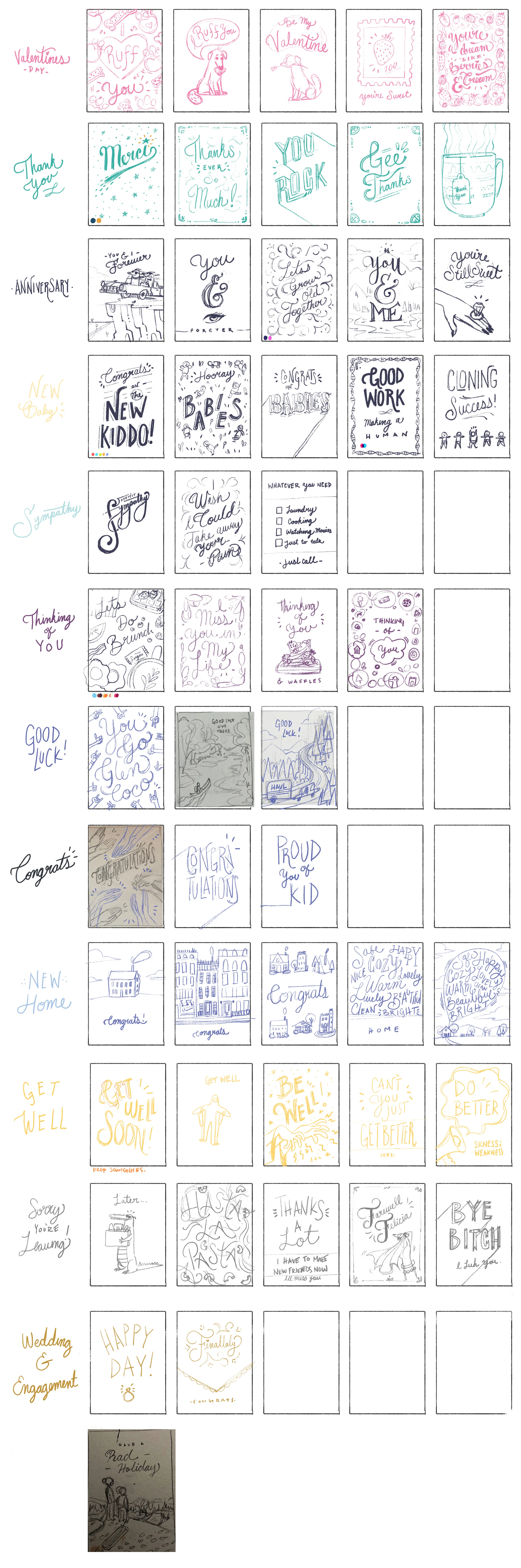
Thumbnail
IDEAS ONLY. No criticism or tightness allowed!
Have fun with compositions and letterforms but don’t be too hard on yourself.
Get all of your questions answered at this stage. Get all copy! Understand your audience where the work will be sold, how it will be printed?

2. Sketches round 1
Here you can start to work the kinks out of your favorite thumbnails ideas. This stage should still be very loose! take your original idea and run with it. Try different letterforms, styles of type, comps etc. Don’t try to refine or polish anything here!
Have an idea of the styles you want to use. Try to use this stage to start solidifying visual elements that will help you tell the story of the project.
Use a chalk board or a huge drawing pad


3. Sketch phase 2
Start playing with color & value as part of your composition. This is where you start to add drop shadows and solidifying filigrees.
Check Readability!
Consider your audience


4. Final
Clients almost always want lettering on a separate layer
Check your spelling!
Package any external fonts you used
Polish type at high resolution incase they need to scale anything or use for marketing purposes.


Helpful tips
Save time on large amounts of text by cutting and pasting letters you have already made.
Free transform-> skew= <3
Auto select of your working with a lot of layers.
Write in fancy letters as often as you can.
Do “Master Copies” often.
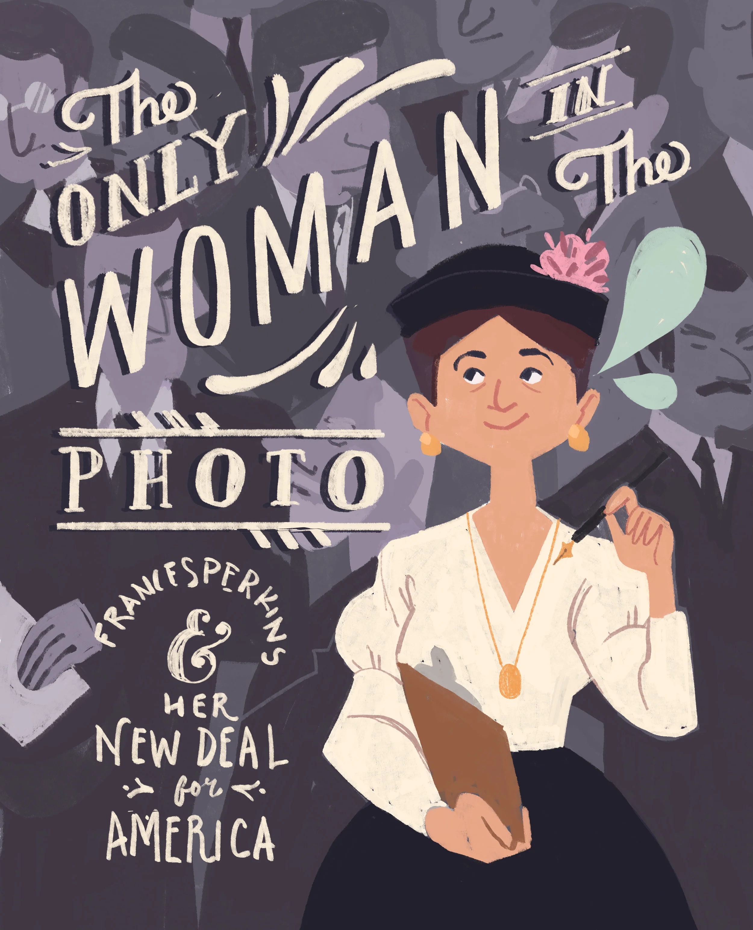
Incorporate lettering into your illustration. Don’t be shy!
Do greeting cards!
Learn graphic design principles and then learn to love them.
Get comfortable with illustrator.
Be efficient.
